My team was tasked with finding a Non-Profit website to redesign. We were drawn to Art Pride NJ for two reasons: they are great advocates for art programs in New Jersey and their art website was clearly lacking art. We wanted to design a website that would show off NJ artists and act as a hub for the art community. Our redeisgned site places the focus back on the art and increases donattion by creating a vibrant energy and color to ao state art website to hold user attention longer.
User Research, Storyboarding, User Flows, Prototyping, and Testing
3 Weeks
Here are photos of the original homepage, which can be found at Artpridenj.org:

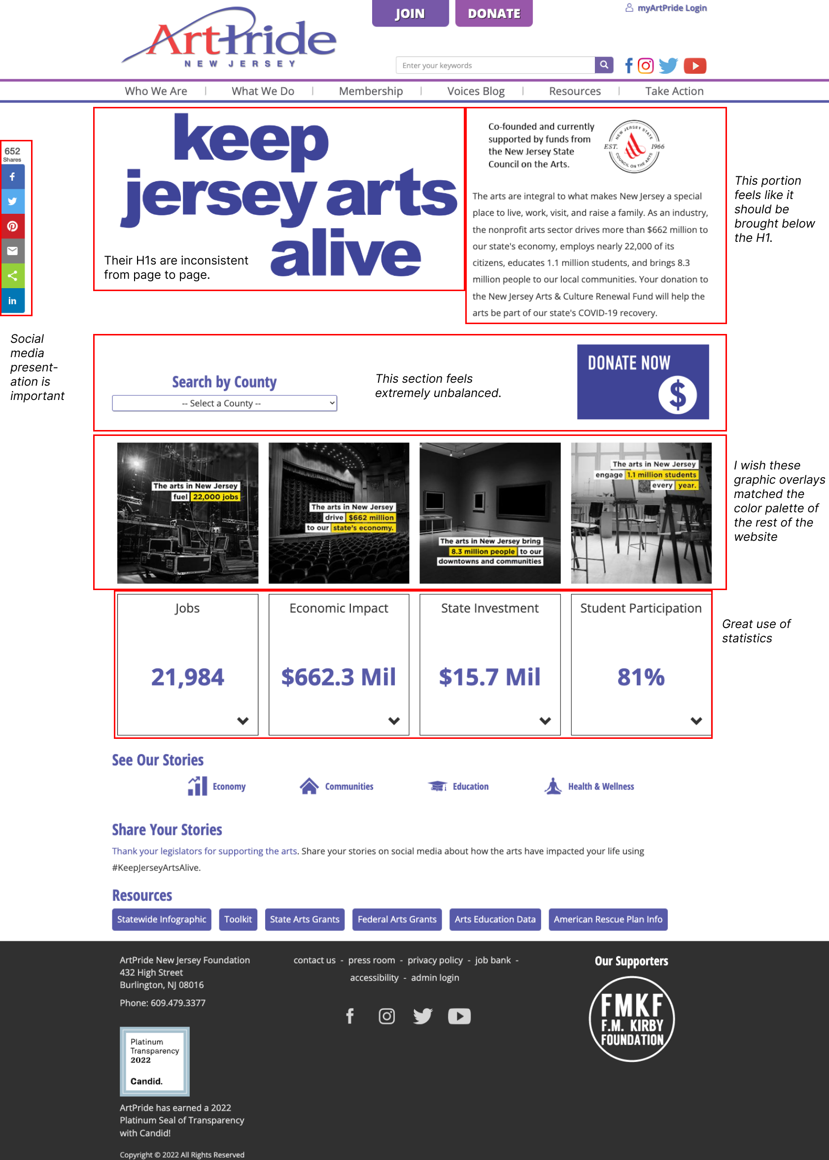
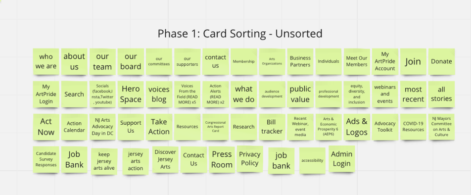
We began our research with heuristic evaluation of key pages of the website. On the homepage, we noted a lack of art, large chunks of text and whitespace, and a disorganized footer.
Our next step was a competitor’s analysis to better understand how other sites in the arts advocacy space were designed. We choose Minnesota State Arts Board and Americans for the Arts (AA) as direct competitor as our group was most familiar with their work. Both sites were text-heavy, but AA had an alluring color scheme. Our indirect competitor was Visit NJ because they were not an arts advocacy site but they had an in-depth list of all art-related events in New Jersey. This allows community members to connect to the art scene.
NJ Art Pride advocates in the government for more art funding and aims to increase attendance to art events by connecting the public to the arts scene. While their advocacy work is up front and center, they don’t focus as much on the art scene they are advocating for.

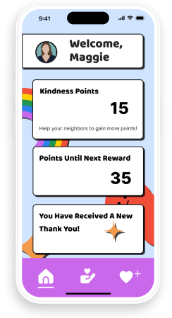
My team and I now had a better idea of who might be interested in using this site. Meet Finn, our proto-persona.
With Finn in mind, we designed an interview and survey to gain more insight into our user. I conducted two interviews, and in total we had 6 interviews and 7 survey responses.
We discovered the 5 key categories that interested our users: Art & Community, Membership, Site Needs, Where Users connect online, and Issues.


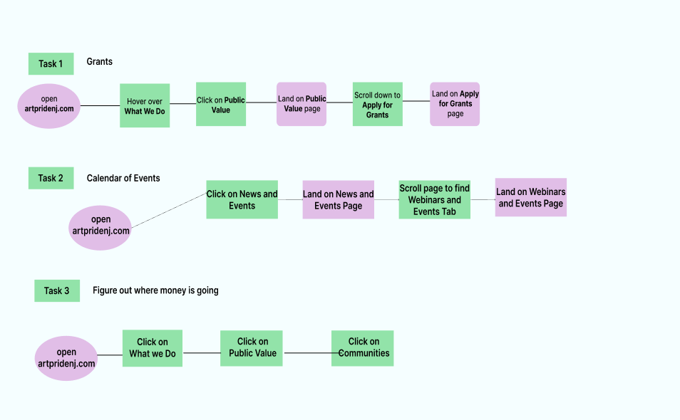
Our next step was to walk in Finneas’ shoes and picked out key pages within the site he might interact with. We used a story board to achieve that.


We have a scenario in which he would use the website, but what features are most important for him?


We used the “ I like, I wish, What if” and the Feature Prioritization Matrix to make this decision. Finneas is most likely to use the grant application page, events page, and the public value page. As an Arts Administrator, he frequently has to find grants for his organization and their clients. As a lover of the arts, he wants to know when and where the fun is! Finally, as a donator, he wants to know where is money is going.
01-- Grant Opportunities:
02-- Calendar of Events:
03-- Where do Donations go:
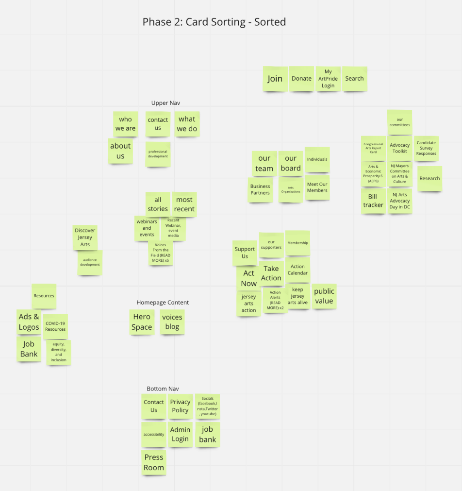
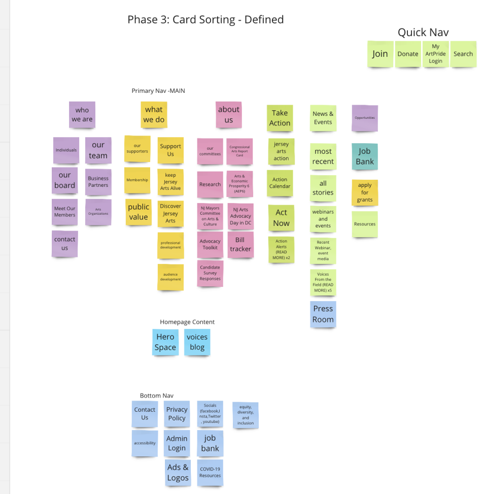
With the User Flow and Information Architecture done, we moved to lo-fi prototypes.


We then had four people test our prototype to see if they could smoothly complete all three user flows. We completed three rounds of user testing. When users tested the above prototype they struggled with finding grants and there were too many options in the News & Events menu. They also didn’t understand what Public Value meant, so we changed it to Community Impact.
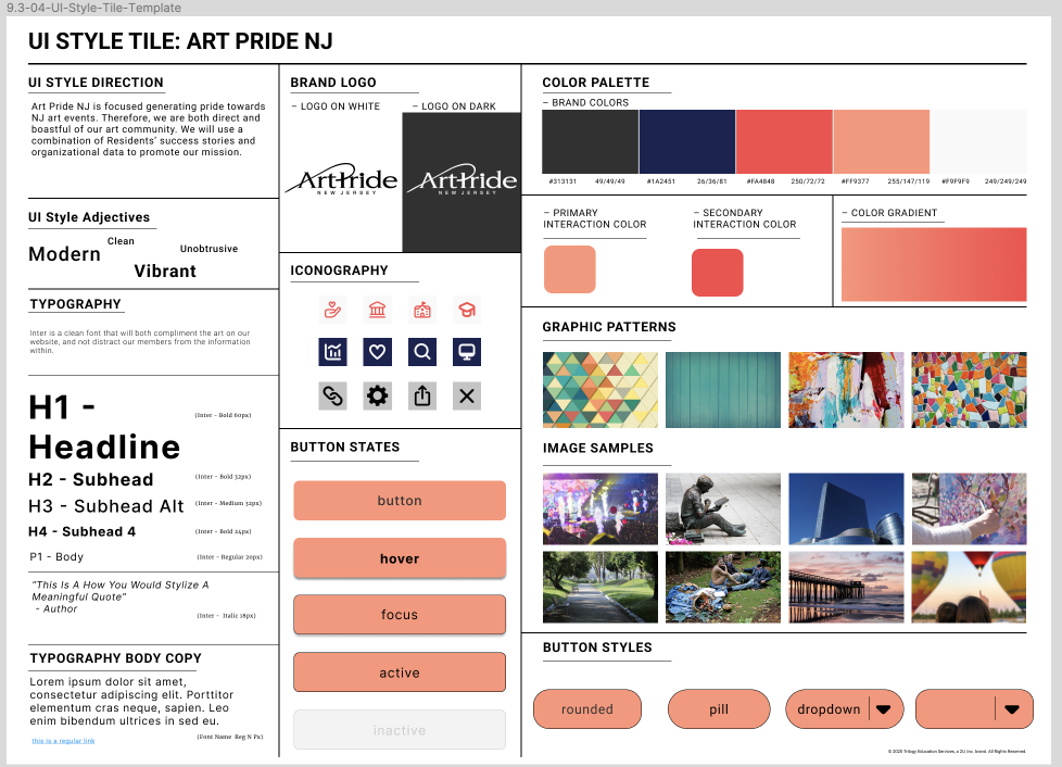
Our next step was to create a styleguide so we could design our hi-fi prototype.
Our final round of testing was with the hi-fi prototype. Users enjoyed the overall design of the site.
See the Prototype on Figma.
This was the first time I ever redesigned a website. Unlike design from the ground up, there are certain details of the website that I could not change. For example, there were so many pages in the upper navigation that made it seem crowded. However, without any input from the stakeholder, I did not know which pages, if any, could be altered or removed.
In this project, I practiced using components to build out an interactive navigation menu. At first our mega menu did not have any images, but our teacher pointed out how empty it looked, so we adjusted.
If we had more time, we would reach out to our stakeholders again to see the most important pages on their site and other important data. We reached out to them in the beginning of our project with no response. Their input would have only made our project more realistic.