I built this portfolio to showcase what I learned in my Bootcamp. This project starts off as a series of homework assignments that then branch of into independent work. I use CSS, HTML, Bootstrap, and Javascript
UX/UI Designer and Front-End Developer
2 months
My first assignment was to garner inspiration from already existing UX portfolios. I used Pinterest, Awwwards.com, Dribble, and Behance mainly. Below is a picture of my original moodboard.

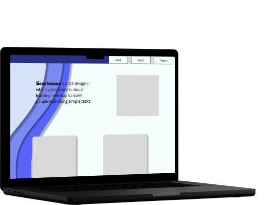
So I designed a lo-fi prototype with the above images in mind. I wanted to keep my portfolio clean and simple, because I wanted to be able to code it in a small amount of time. Although I did have some coding experience before this course, it didn’t click for me until now. I needed to be able to use this portfolio to practice. I planned to illustrate a drawing of myself to put in the upper square next to the “About Me” blurb. Then three case study mockup pics would follow with alternating alignment to take up more space.

So our next step was designing an interview and survey . We asked participants about their history with mindfulness apps, what they got out of them, and how/if they were still using the app. We also asked participants how they go about being kind in their daily life, how does it feel, and what stops them from being kind.
I designed the survey on typeform. There were 10 responses. The following are some of the questions and their results.


Our interviews gave us a lot of data.

So we broke it up further into an affinity diagram.

Our final iteration of the affinity diagram.

Using this data we crafted a user insight statement. Our user, who is concerned with people around her, needs a simple and consistent way to be kind to herself and others because she enjoys the feeling she gets from helping other people.

Before brainstorming the features for our app we conducted a competitor analysis to see what other successful apps are doing. Our direct competitors, Calm and Headspace, came from our interviews. Both Calm and Headspace have guided meditations and soundscapes to help with sleep and relaxation. Calm is the mindfulness app of choice for parents due to ease of use and sleep stories for kids. Headspace offers a structured path to mindfulness. Both apps are well-known but several users (in our interviews, survey responses and even app reviews) mentioned not using either app beyond the free trial as they did not see the value in paying for the subscription.
We used Craigslist and Nextdoor as indirect competitors. Though neither app was created with the intention of spreading kindness, they are both apps that people use to connect with their neighbors for various purposes, including buying/selling/trading items, sharing news, information and recommendations.
With our user persona and competitor analysis in hand we brainstormed features that Margaret might want. Some of these ideas came straight from our interviews. Then we implemented dot voting to identify our favorite concepts that would best serve our users.

Then came the Feature Prioritization Matrix to narrow down our ideas. From this, we decided the primary feature of our app would be facilitating opportunities for users to do kind acts for others in their community. Other features would be points, badges, and closing daily rings in order to encourage retention.

We developed a storyboard to further clarify our solution and how users would interact with our app.

The Storyboard allowed us to create four main task flows for Margaret.
1. Sign up for Kindful and view the tutorial onboarding screens

2. Complete an act of kindness for a neighbor

3. Request an act of Kindness

4. View weekly Kindful status on an smartwatch

At this point we had a good idea of what our app was about. So now for the fun part -- Prototyping!
Here are some of our paper sketches

And now lo-fi wireframes.

Time for the first round of usability testing on our 4 tasks. We had 4 different people test our lo-fi prototype. These were the goals:
Though each user was able to sign up for the app, that task wasn’t without its hiccups. At this point in the prototyping process, we hadn’t added iOS UI so some users hesitated for a moment expecting keyboards to popup. We discovered we should rename our “task” page for user understanding so it was later renamed to “available acts of kindness.” Additionally there were opportunities to make our concept more clear by adding copy and images to our onboarding, home, and available acts of kindness screens.
100% success rate
62.5% success rate
75% success rate
87.5% success rate
We used Pinterest to collaborate on a mood board as a team. We wanted our app to feel bright and joyful. We selected imagery with colorful characters, expressive faces, highly saturated colors, and geometric shapes. We then placed our inspiration images together in a grid in Figma to refer to during our design process.

We then selected the images from our Mood Board that best exemplified the design direction for our app. The UI for our app would be energetic, playful and neo-brutalist with high contrast and defined edges. We selected Baloo as our main Header font as it was playful and bold and used Inter for other text for balance. We picked some key shapes, applied an distinct shadow and created some high contrast black and white buttons to match.

We returned to our mid-fi prototype and applied the changes to create a hi-fi prototype.

To view our high fidelity mobile prototypes: click here.
To view our high fidelity Apple Watch prototypes:click here.
After we iterated to high fidelity, we revisited Usability Testing to ensure the changes we made improved the function of our app. Again, we tested 4 subjects using the same objectives from our original round of testing. This time we had a 100% success rate for all participants for all 4 tasks! A huge improvement from the first round of testing. Again, the test wasn’t without tiny hiccups. We originally missed connecting some frames that lived outside of our task flows. We made the necessary adjustments and fixed things like ensuring the iOS Home Indicator remained in view at the bottom of each screen.
My teammate used our style guide to design our landing page. Then I translated her design to code using Visual Studio Code and Git Hub. I used Bootstrap to format the page, and HTML and CSS to customize the framework. The most difficult part for me was formatting the images. At first I used the position property, but quickly realized that was not responsive. After instructor feedback, I decided to use the margin property to scatter the images while maintaining responsiveness.
To view the Github Repository: click here .
To view our completed landing page: click here .
Throughout this process, I learned how to incorporate new interactions and animations in Figma with the purpose of adding more fun and interest to our prototype. I also deepened our knowledge of Bootstrap to code our marketing landing page. Due to the time constraints, I had to work smarter. Utilizing Bootstrap, leveraging media queries, and adjusting CSS allowed me to achieve our desired interactions and responsiveness in a shorter timeframe.
Scope Creep was in issue with this project. Even with a feature list carefully chosen, we realized while creating our wireframes, there were narrative gaps in our prototype. We almost started building our app larger, but a faculty member assisted us in clarifying our task flow, and reminded us this was a beginning iteration.
For future iterations we would to incorporate the following feature:

